YUMMYZ Dog Treats Case Study
The pet food aisle is dominated by two extremes: serious, clinical designs signaling health, then playful, but often goofy, economy-driven packaging. I set out to redefine this landscape by elevating the whimsy and approachability typically seen in economy brands, while incorporating the clean, straightforward aesthetic thriving in high-end DTC brands.
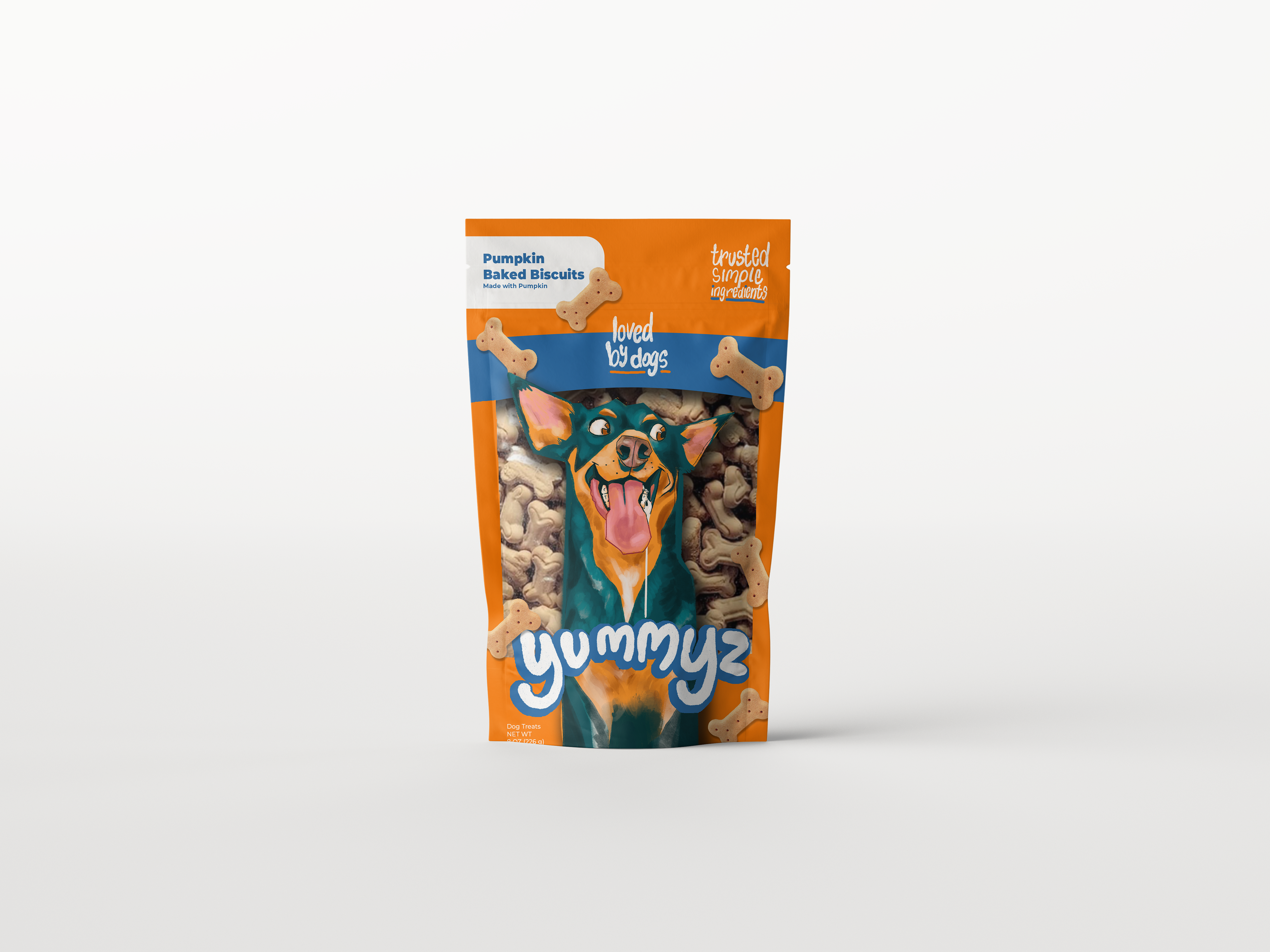
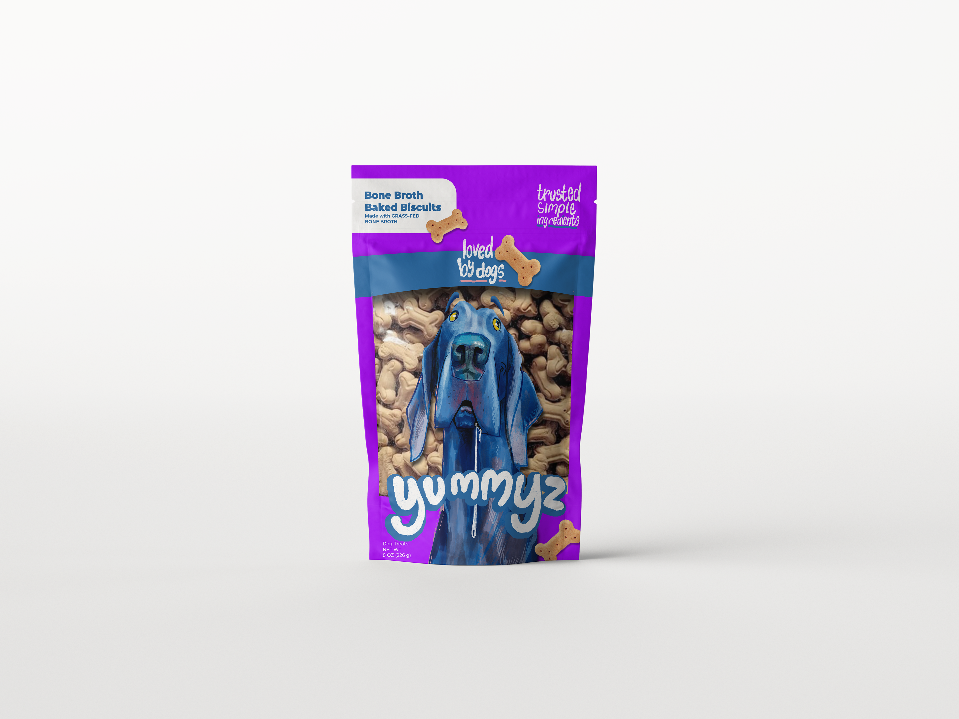
By combining hand-drawn illustrations with custom lettering, I crafted a bold sophisticated visual language that commands on-shelf attention, and provides a foundation for effortless category expansion.
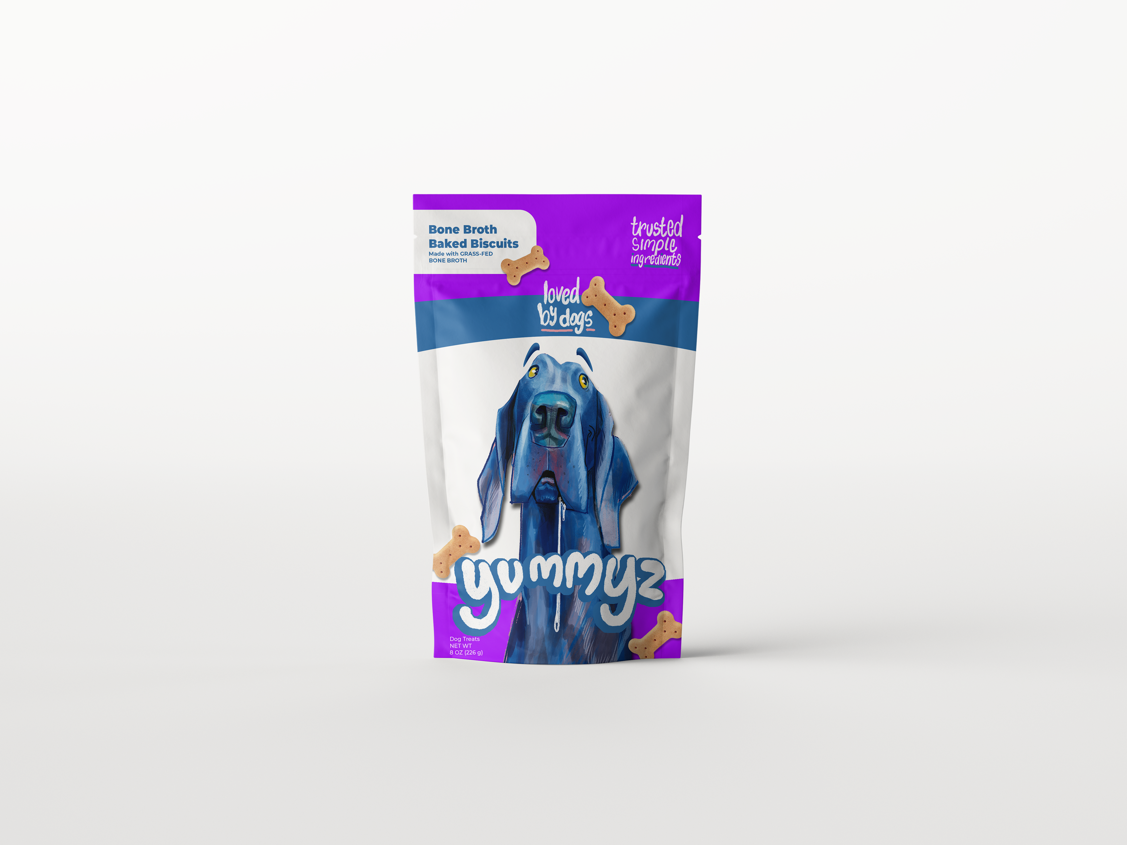
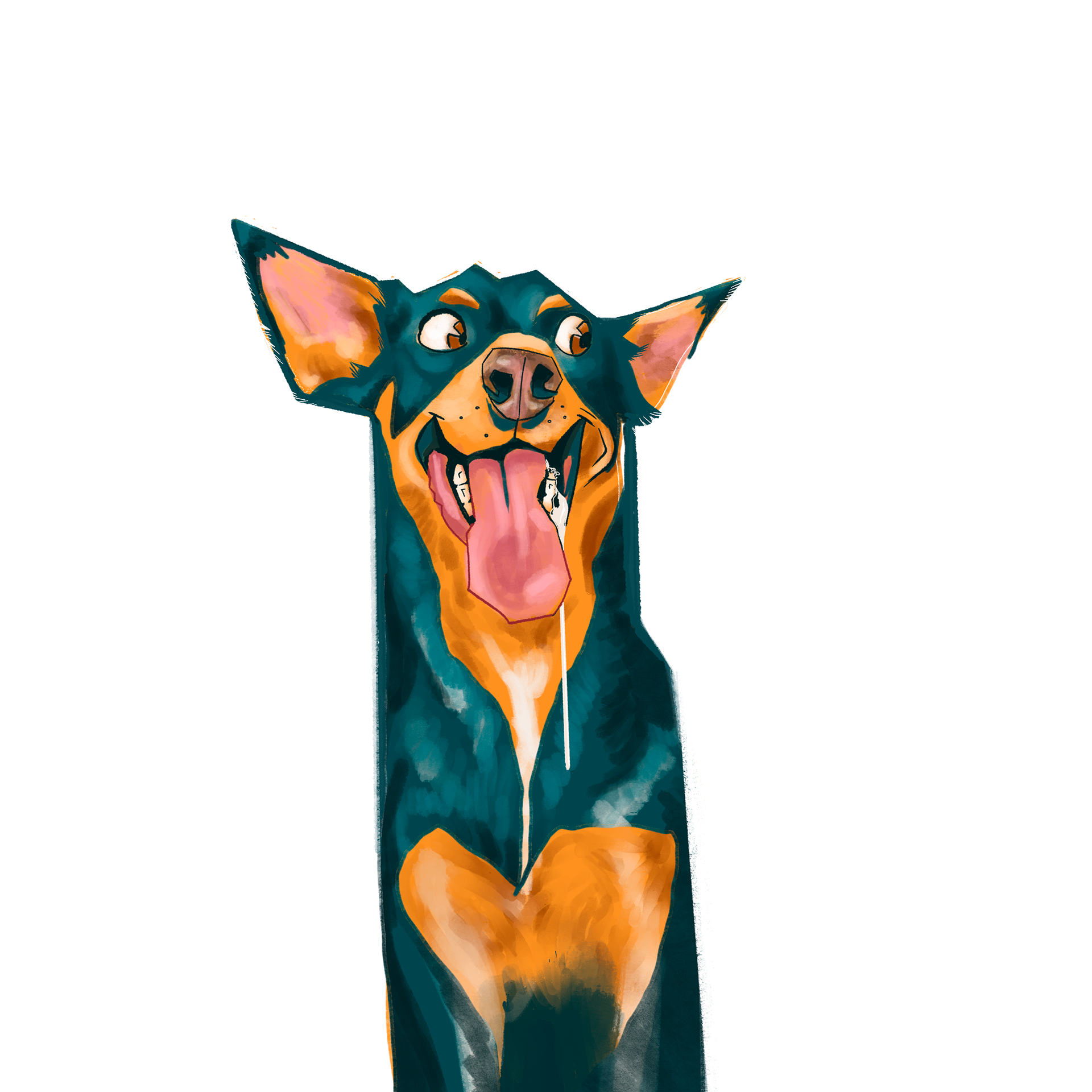
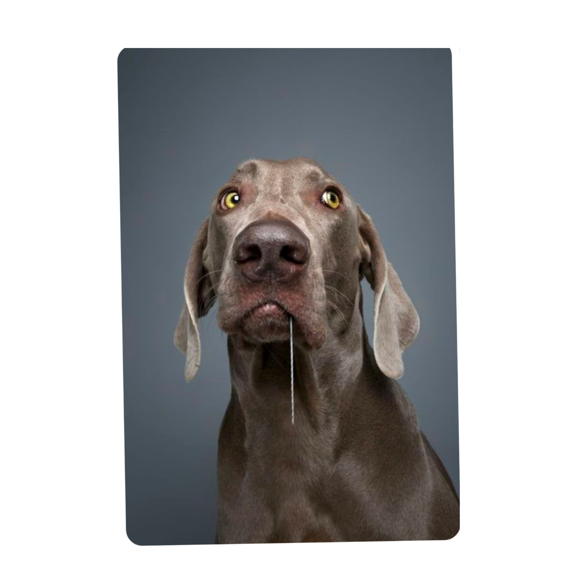
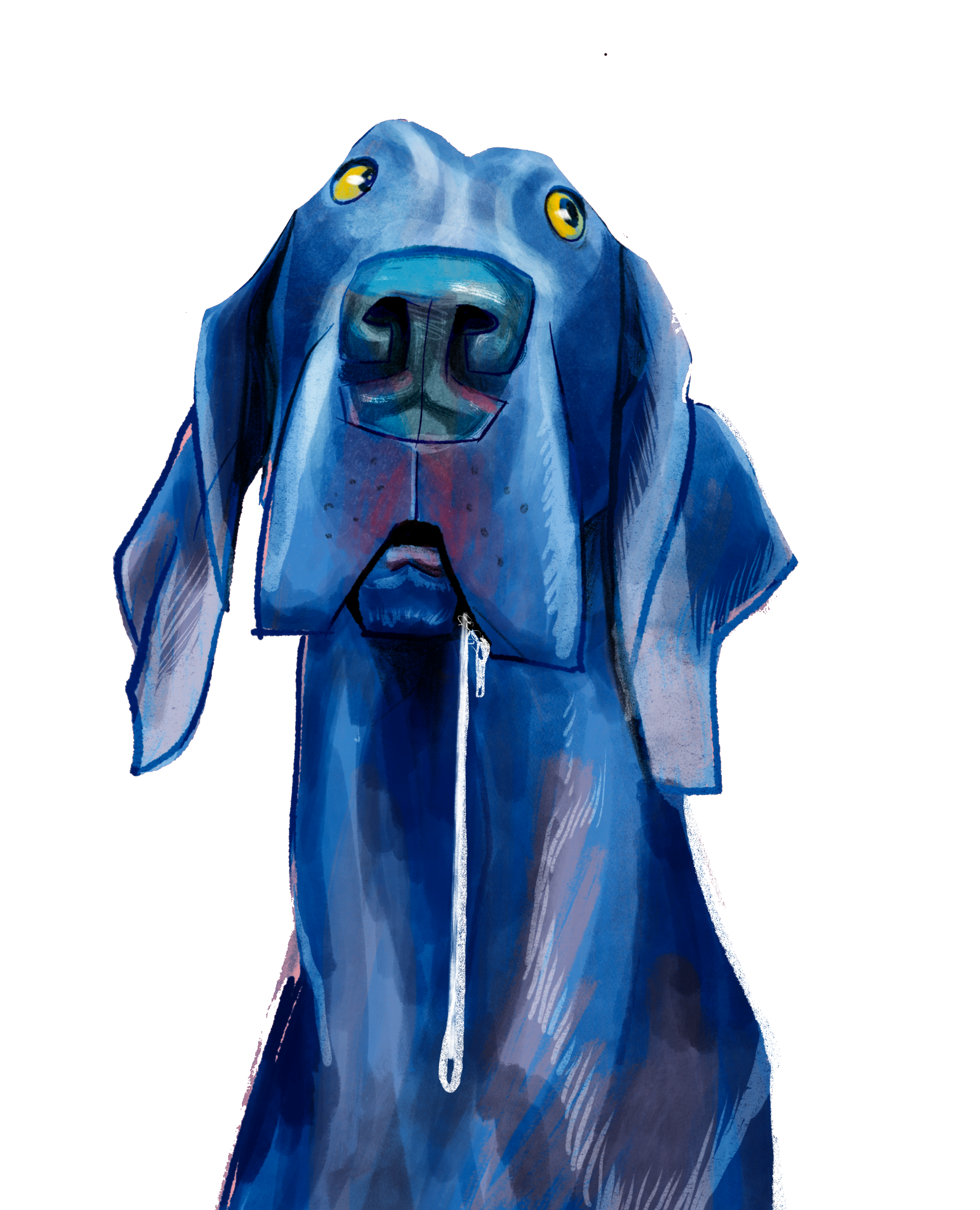
I explored illustration styles that captured the playful, endearing spirit of pets while balancing whimsy with sophistication. After experimenting with watercolor, vector, and gouache-inspired techniques, I refined an angular, expressive textured style. This would elevate and provide the strong brand cohesion I was intending. Paired with clear visual hierarchy, This would create strong shelf appeal.

I developed three design options, creating mockups and testing them on-shelf against competitors. This iterative process allowed me to refine the visual strategy, ensuring a standout design that delivers maximum shelf impact, drives consumer engagement, and aligns with my overarching vision for the brand.
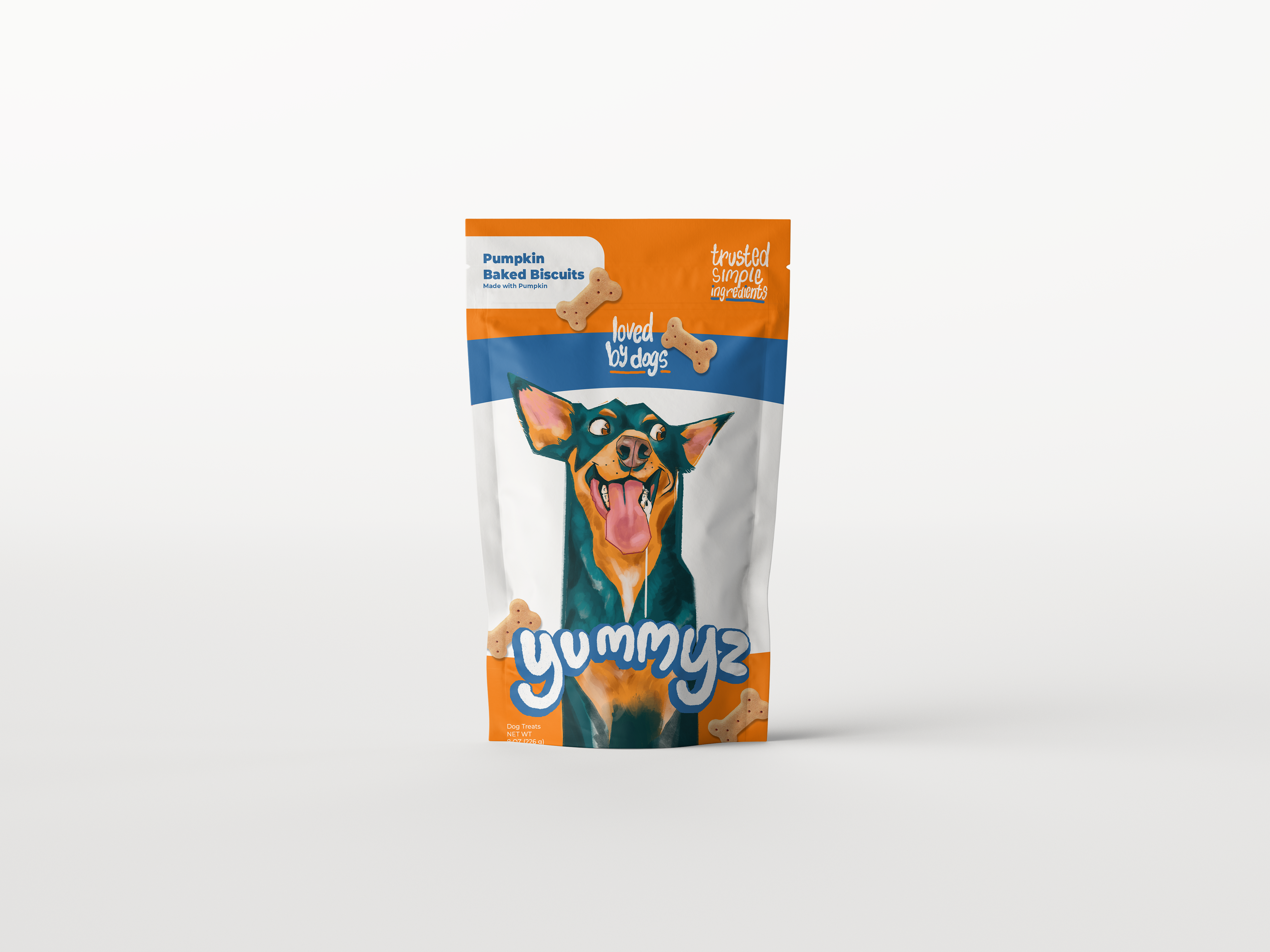


I would present all three options while strongly advocating for the design with increased white elements. This solution optimizes shelf visibility, sustains an engaging, playful tone, and strategically balances premium-quality illustrations with a clean, elevated aesthetic—positioning the brand as approachable yet distinctly upscale, steering clear of economy-brand connotations.

