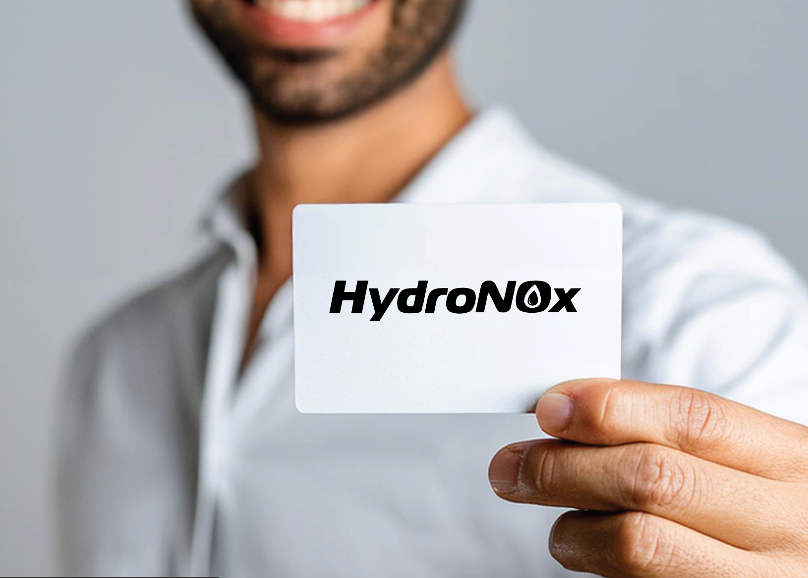
HydroNOx logo refresh
Vireo Systems sought a dynamic logo for HydroNOx, their proprietary ingredient aimed at enhancing blood oxygenation.The design needed to convey energy, reference blood, and incorporate the scientific notation for Nitric Oxide (NO). Additionally, it had to distinguish itself from the CON-CRET Creatine branding without causing distraction. To achieve this, I integrated a droplet into the center of the 'O', symbolizing blood when depicted in red, while maintaining versatility for monochromatic applications.
To convey a dynamic, futuristic aesthetic in line with current sports nutrition branding trends, I selected typography featuring rounded, simplified letterforms with an oblique slant, drawing inspiration from science fiction motifs reminiscent of Star Wars. This design choice imparts a sense of motion and modernity, ensuring the logo is both impactful and professional, aligning with contemporary consumer preferences in the sports nutrition market.
AFTER/BEFORE